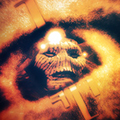
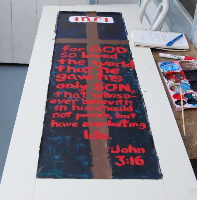
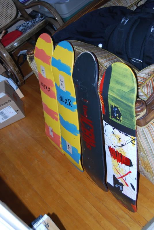
so when i'm not butchering amazing guitars or creating minimal noise i paint..
most of my stuff is found on deviantart.com but i figure i'll post some of it here
and i need to take some shots of my work i've done in `08 still
(edited out broken links, will repost eventually)
serfx painting/sketches/whatever thread
Moderated By: mods
-
serfx
- ss.o bastard son
- Posts: 6411
- Joined: Tue Jan 15, 2008 11:34 pm
- Location: Edmonton Alberta
- Contact:
serfx painting/sketches/whatever thread
Last edited by serfx on Sun Feb 20, 2011 10:21 pm, edited 3 times in total.


-
johnniespring

- .

- Posts: 631
- Joined: Thu Apr 20, 2006 7:15 am
- Location: sheffield, england
- Contact:

-
Jackackack
- .

- Posts: 52
- Joined: Fri Nov 14, 2008 8:07 pm
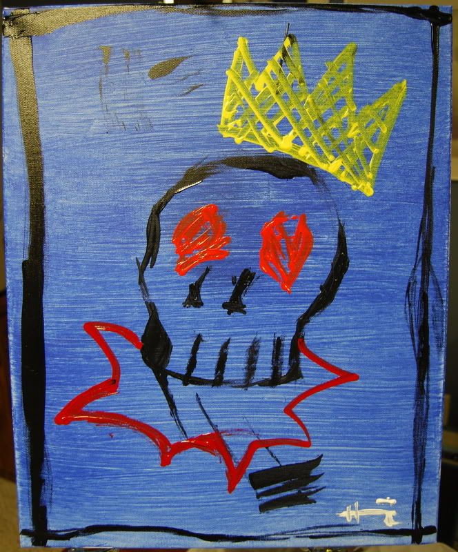
BasquiatBasquiatBasquiatBasquiatBasquiatBasquiatBasquiatBasquiatBasquiatBasquiatBasquiatBasquiatBasquiatBasquiatBasquiatBasquiatBasquiatBasquiatBasquiatBasquiat
BasquiatBasquiatBasquiatBasquiatBasquiatBasquiatBasquiatBasquiatBasquiatBasquiatBasquiatBasquiatBasquiatBasquiatBasquiatBasquiatBasquiatBasquiatBasquiatBasquiat
BasquiatBasquiatBasquiatBasquiatBasquiatBasquiatBasquiatBasquiatBasquiatBasquiatBasquiatBasquiatBasquiatBasquiatBasquiatBasquiatBasquiatBasquiatBasquiatBasquiat
BasquiatBasquiatBasquiatBasquiatBasquiatBasquiatBasquiatBasquiatBasquiatBasquiatBasquiatBasquiatBasquiatBasquiatBasquiatBasquiatBasquiatBasquiatBasquiatBasquiat
BasquiatBasquiatBasquiatBasquiatBasquiatBasquiatBasquiatBasquiatBasquiatBasquiatBasquiatBasquiatBasquiatBasquiatBasquiatBasquiatBasquiatBasquiatBasquiatBasquiat
Guitars:
2014 American Deluxe Stratocaster
2013 Gibson SG 61RI
1998 Paul Reed Smith CE22
2014 American Deluxe Stratocaster
2013 Gibson SG 61RI
1998 Paul Reed Smith CE22

-
serfx
- ss.o bastard son
- Posts: 6411
- Joined: Tue Jan 15, 2008 11:34 pm
- Location: Edmonton Alberta
- Contact:
blane wrote:BasquiatBasquiatBasquiatBasquiatBasquiatBasquiatBasquiatBasquiatBasquiatBasquiatBasquiatBasquiatBasquiatBasquiatBasquiatBasquiatBasquiatBasquiatBasquiatBasquiat
BasquiatBasquiatBasquiatBasquiatBasquiatBasquiatBasquiatBasquiatBasquiatBasquiatBasquiatBasquiatBasquiatBasquiatBasquiatBasquiatBasquiatBasquiatBasquiatBasquiat
BasquiatBasquiatBasquiatBasquiatBasquiatBasquiatBasquiatBasquiatBasquiatBasquiatBasquiatBasquiatBasquiatBasquiatBasquiatBasquiatBasquiatBasquiatBasquiatBasquiat
HHHHHHHHHHHHHAAAAAAAAAAAAAA! i never saw that before
oh so much basquiat/pollock inspired/ripping off i am yes.
you can hardly tell that i'm also hugly warhol influenced.
i have some newer stuff but not pics atm.
i'll take some in the morrow.
they are.. a change from what is above.

I like the Pollock stuff, and would like to see it taken even further. Avoid text or symbols and trying to get the same effect from the colors themselves. For example, red and yellow are already safety colors. Don't think about what you want to say in them. Just paint and find out what they say. What you think and feel will come out even if you want to hide them. You may be experimenting with primary colors, but the richness is in the blends. Go from 3 to 3 million.
I don't mean to take the expert tone. I am old and have heard this same shit for years. Just passing it on. Take it for what it's worth, or do it as an exercise. I am drowning in abstraction right now.
I don't mean to take the expert tone. I am old and have heard this same shit for years. Just passing it on. Take it for what it's worth, or do it as an exercise. I am drowning in abstraction right now.
Yell Like Hell
-
matocaster

- .
- Posts: 161
- Joined: Sat Feb 07, 2009 10:34 pm
- Location: The rose capital of Iowa
-
serfx
- ss.o bastard son
- Posts: 6411
- Joined: Tue Jan 15, 2008 11:34 pm
- Location: Edmonton Alberta
- Contact:
i just saw this and much appreciate the input.DGNR8 wrote:I like the Pollock stuff, and would like to see it taken even further. Avoid text or symbols and trying to get the same effect from the colors themselves. For example, red and yellow are already safety colors. Don't think about what you want to say in them. Just paint and find out what they say. What you think and feel will come out even if you want to hide them. You may be experimenting with primary colors, but the richness is in the blends. Go from 3 to 3 million.
I don't mean to take the expert tone. I am old and have heard this same shit for years. Just passing it on. Take it for what it's worth, or do it as an exercise. I am drowning in abstraction right now.


-
endsjustifymeans

- Grown Up Punk
- Posts: 19442
- Joined: Tue Feb 10, 2009 4:02 pm
- Location: Ball So Hard University


